Swords Of Ditto
2018 © Onebitbeyond
Microsoft Windows, Steam, PlayStation 4
In 2017, I worked as a freelance UI designer on Swords of Ditto by OnebitBeyond, a small indie team. The game is an action RPG with roguelike elements and was released on PC and console in 2018.
Working from game design briefs, I defined UI flows for the core game loop, including boot flow, main menu, settings, and bespoke feature screens such as equipment, inventory, HUD, and other supporting interfaces. I researched relevant genre titles to identify familiar player affordances and effective information presentation, then produced layout options that accounted for localisation extremes and worst case content scenarios. Final layouts were aligned with the game director before visual styling was applied.
When I joined, the game had a strong 2D art direction but no established UI style. Using the playful, colourful tone of the game as a foundation, I explored multiple UI style directions and developed the final look in collaboration with the director and 2D artist. The goal was to create a UI that blended naturally with the game world while remaining clearly readable and distinct from in world elements, drawing on tactile, slightly battle worn textures with a subtle hand drawn quality.
I then produced fully styled menus with a focus on consistency, reusability, and technical constraints such as scalable textures, and delivered a complete suite of UI assets ready for implementation.
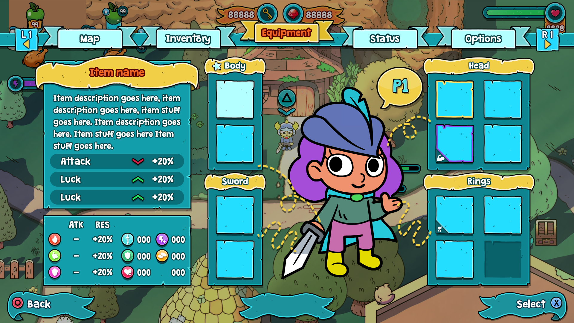
Equipment
The equipment screen served as a loadout for the player's character. The main goal was to provide a simple but clear overview of currently equipped items and their stats and status.
Inventory
The goal of the inventory was to keep the layout simple and surface the most critical information for each item in a clear manner.
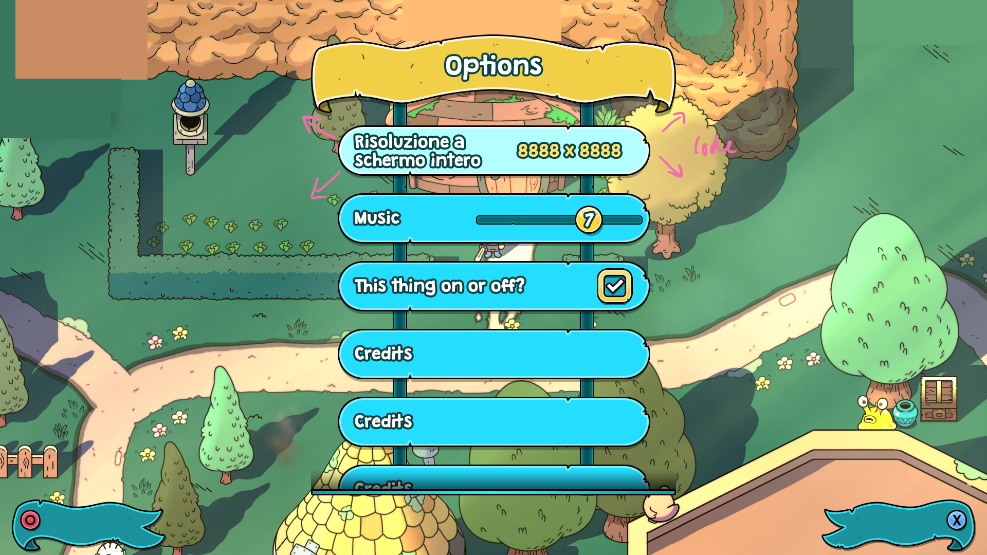
Options
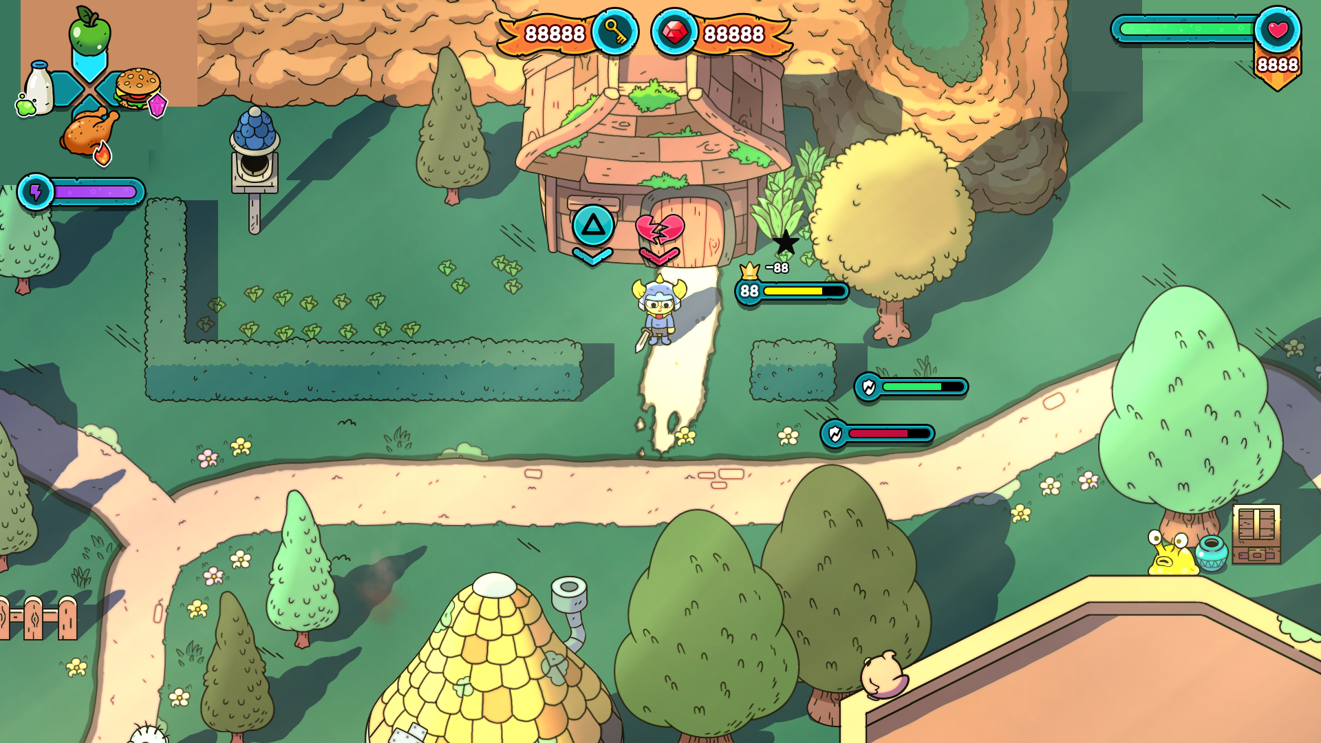
HUD
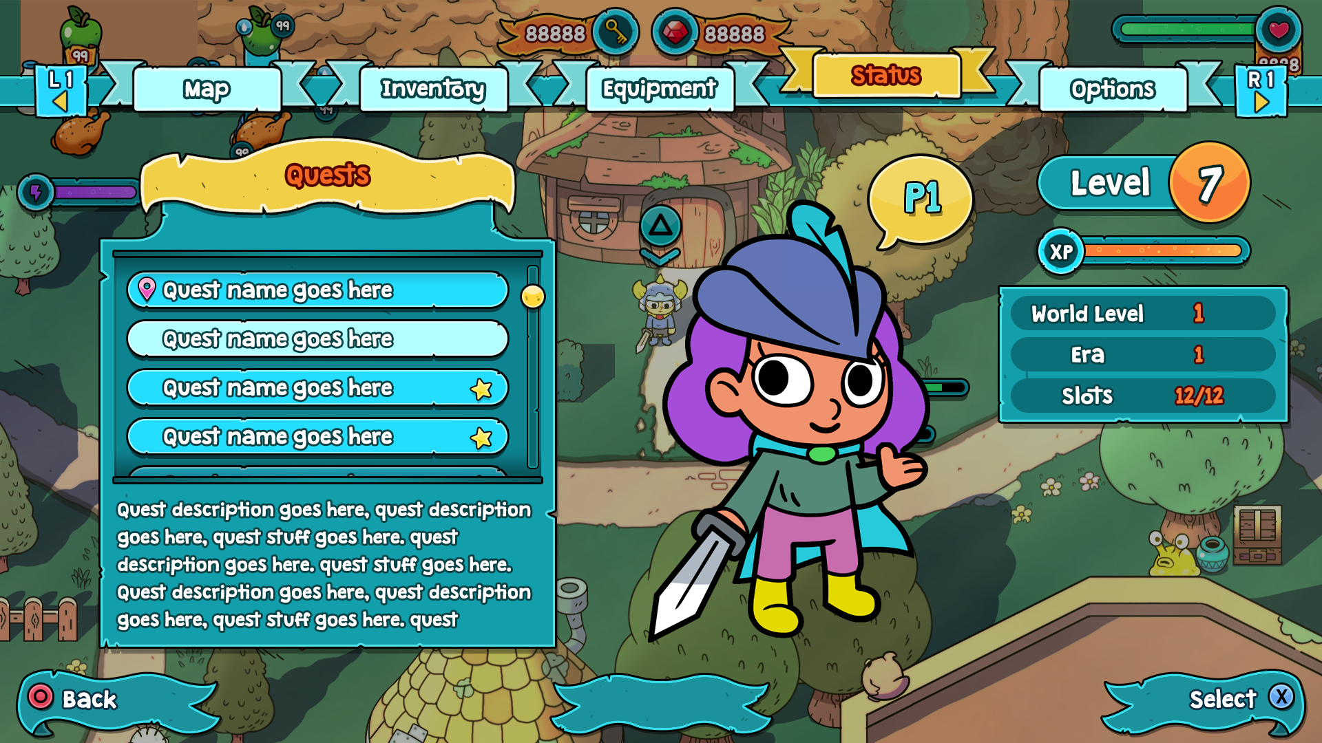
Status Screen
The status screen served as a snapshot of the player's progression, showing stats about their level and playthrough data as well as information about currently available quests.
Map
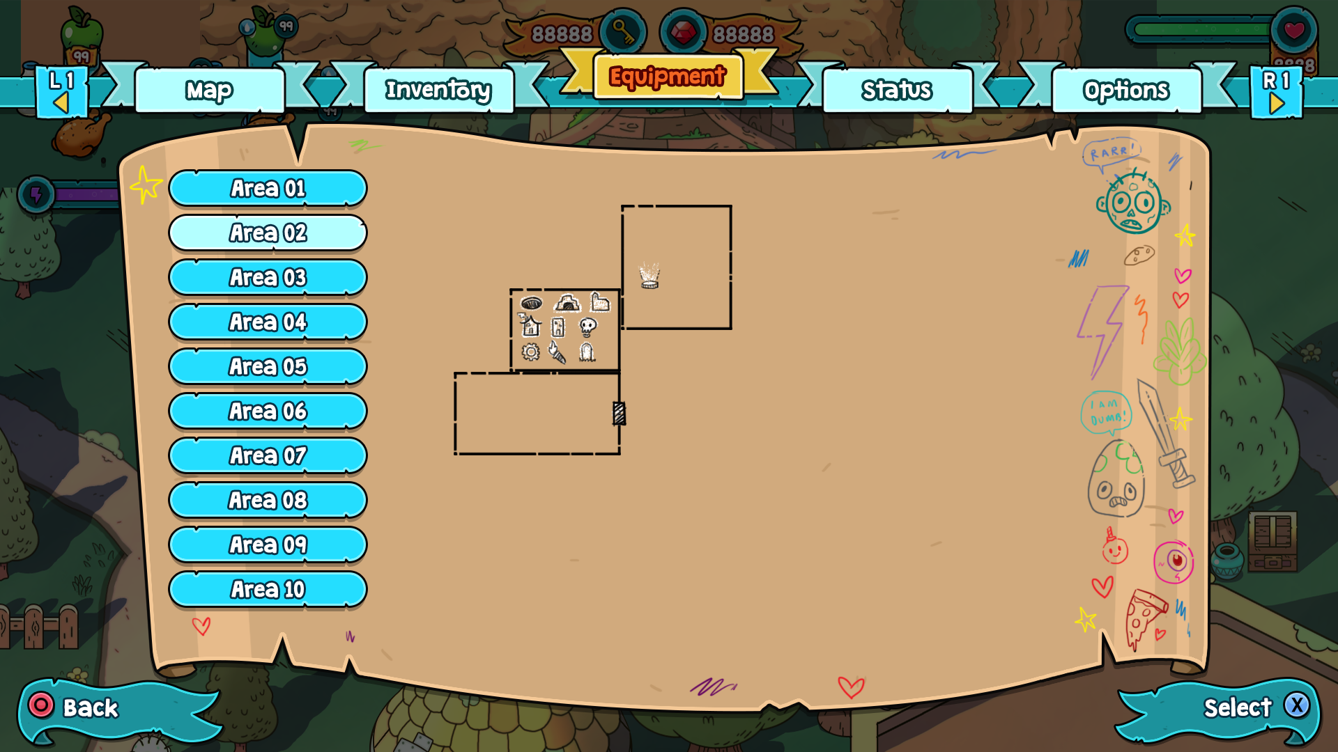
The map expanded as the player discovered new areas of the world. To capture that concept and to tie into the adventurous child like quality of the player characters I designed the map to have a hand drawn pirate map like quality as though the character drew it as they explored.
