Gears Tactics
2020 © The Coalition and Splash Damage
Microsoft Windows, Steam, Xbox One, Xbox Series X/S
Gears Tactics is a turn-based tactics game within the Gears of War franchise. I was Lead UI designer, responsible for the overall UI vision and execution across the project. I worked with a large team of UI designers, artists, engineers and game designers, ensuring visual consistency, usability, and alignment with both gameplay needs and the Gears of War franchise identity.
The main areas of design focus I had were on UX improvements to customisation, barracks, missions and other front end features as well as areas of in-game features in the HUD. I conducted multiple internal user testing sessions using wireframes and click-through prototypes to identify key areas of confusion for players to inform design and flow improvements to existing and new features.
Alongside hands-on design work, my primary focus as a lead was to support the team by supporting feature work of other designers, removing blockers, facilitating cross discipline communication and maintaining alignment between various disciplines throughout production.
Customisation and Barracks
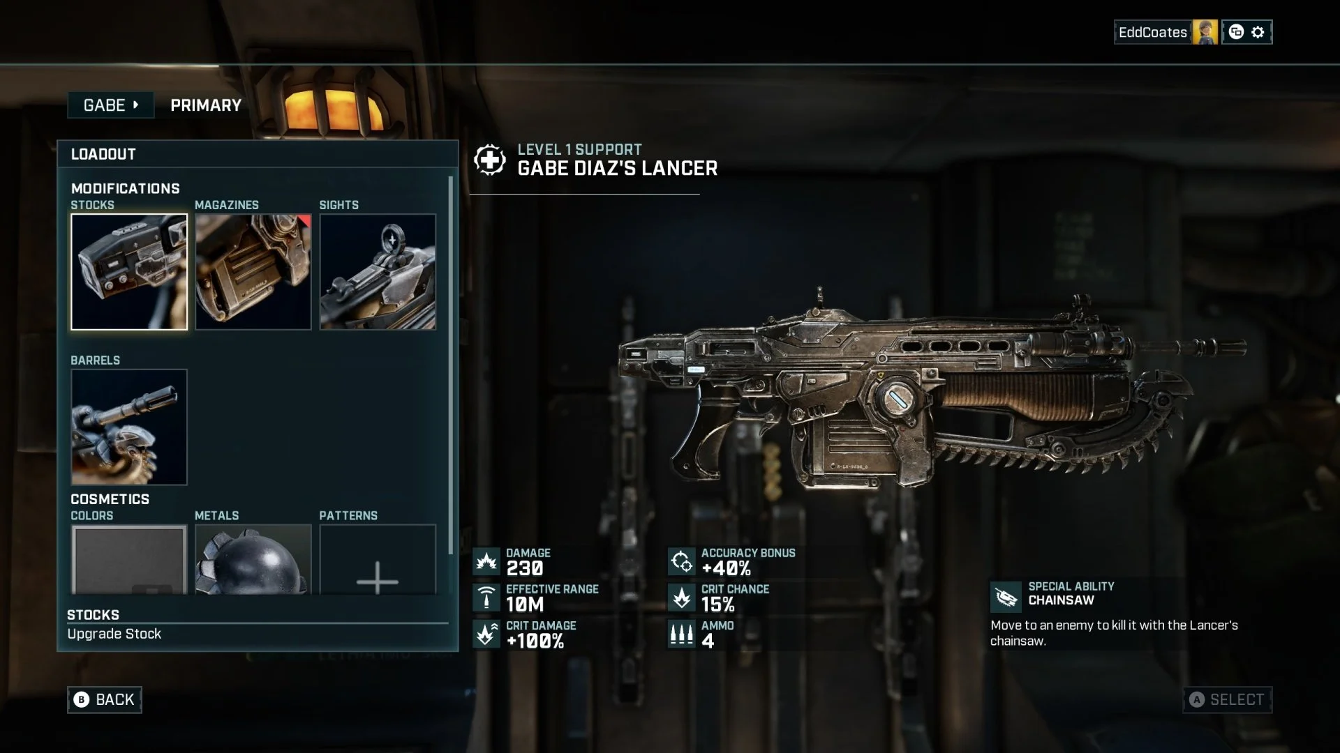
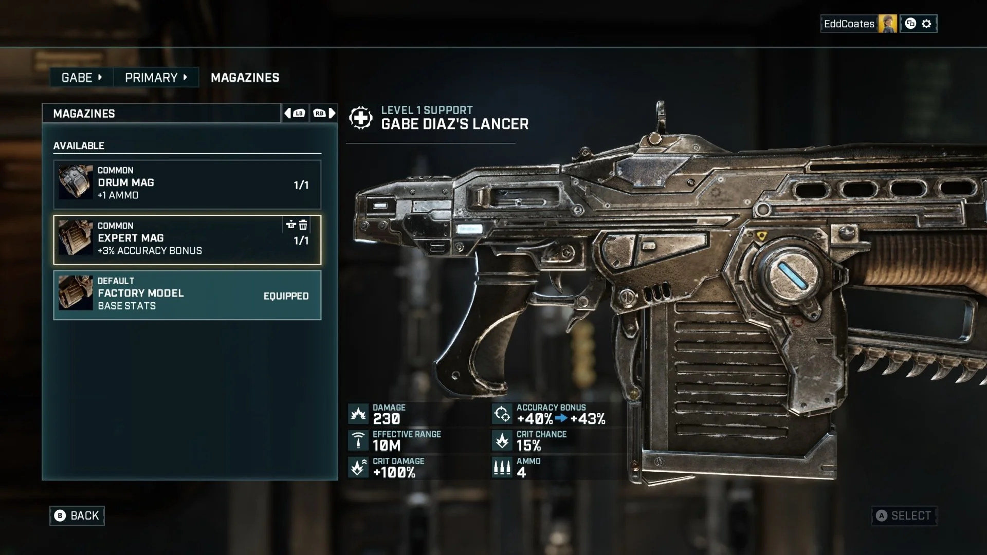
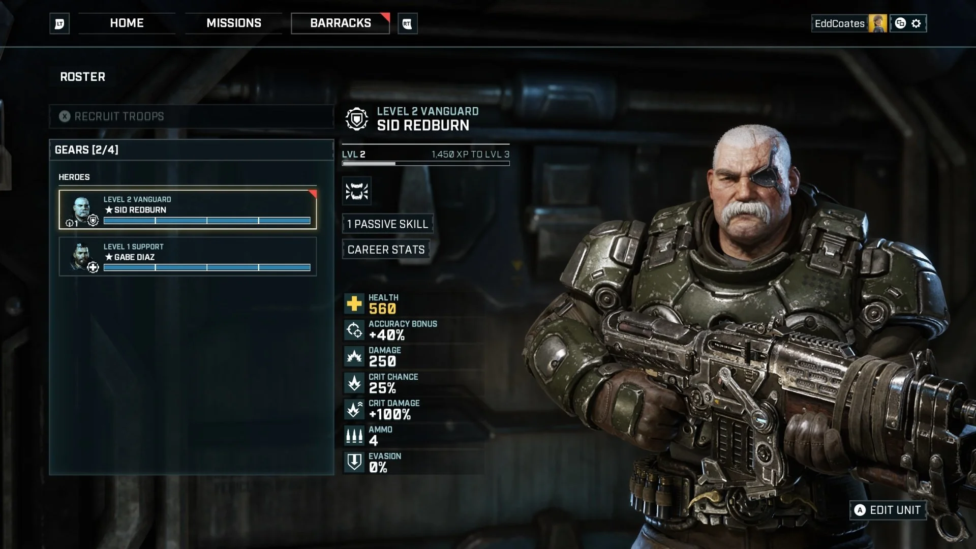
For the customisation screens and barracks, consisting of a roster of characters for the player to modify and upgrade, my primary focus was to finish incomplete features and improve on the overall usability and flow of these features as well as identify areas of improvement for localisation needs and basic accessibility for text readability.
I started with rounds of user testing with the existing feature to identify core issues which were primarily due to unclear visual hierarchy of information, too many steps in navigation and unclear calls to action and overloading of information. I used the information gleaned from this to redesign key areas and information presented in these features to improve the general usability, validated with further rounds of user testing.
The primary goal was to ensure clear, immediate understanding of characters, progression and equipment, surfacing critical information to the player in a quickly readable manner without overloading the player.
HUD
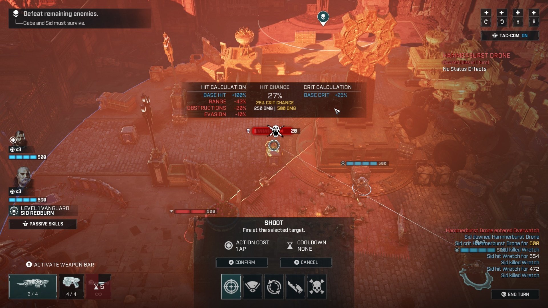
The key challenge faced with the HUD was supporting the standard display as well as the Tac-Com feature across a range of aspect ratios, which at this time also required 4:3 which resulted in limited space. The Tac-Com feature displayed additional indepth stats and other information to the player, supplementing the core HUD. At times a large amount amount of text information and stats could be required to be displayed depending on the in-game event circumstances.
An additional challenge was maintaining a minimum font size and contrast for accessibility and general readability purposes. Earlier direction prioritised minimal UI obstruction over gameplay whilst still requiring large amounts of information to be shown, which posed an interesting challenge whilst limiting conventional readability solutions. I explored various solutions whilst continuing to advocate for accessibility considerations and reached a compromise using gradient treatments that improved contrast without overtly compromising visual clarity. However, there are some instances with particular background colours where this is at times still an issue of readability, such as the example below, but the addition of the gradient and stroke lines around the text is a marked improvement in the majority of environment backgrounds.
Missions
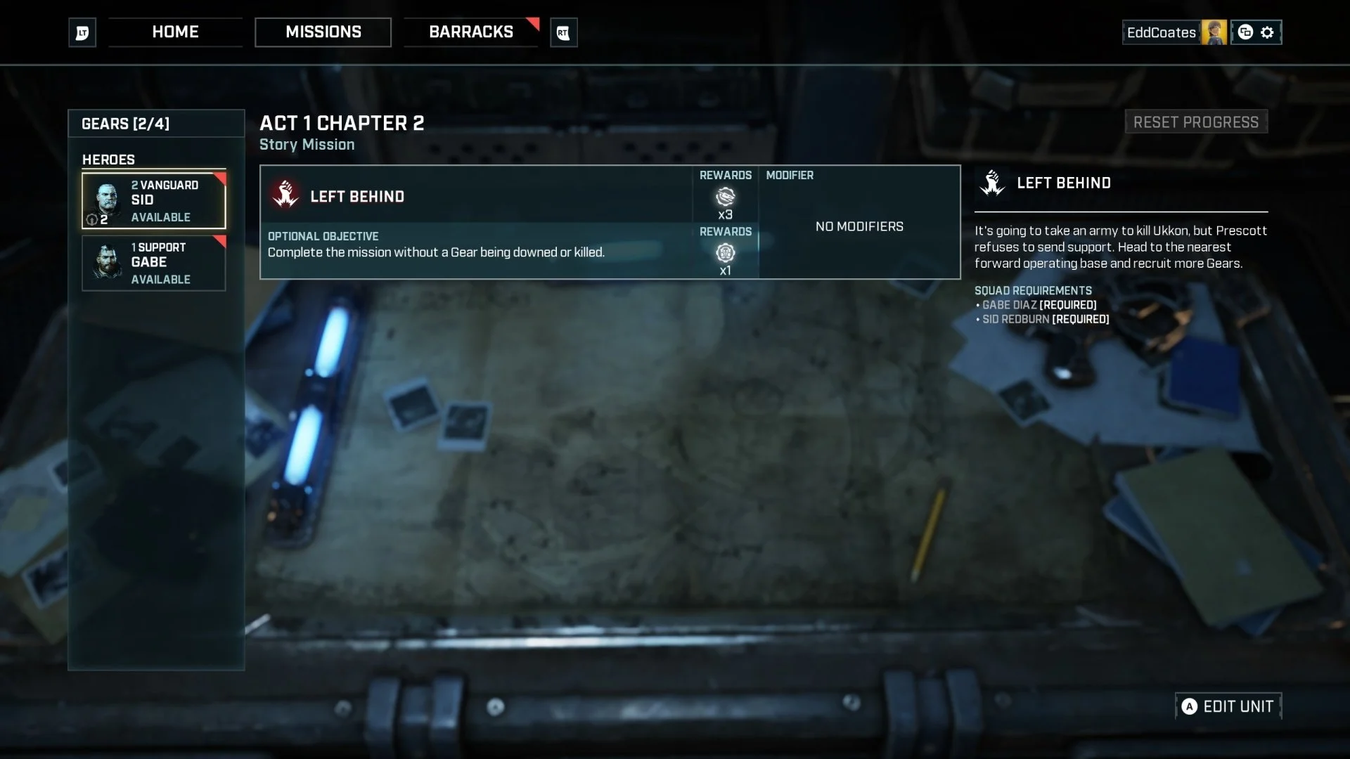
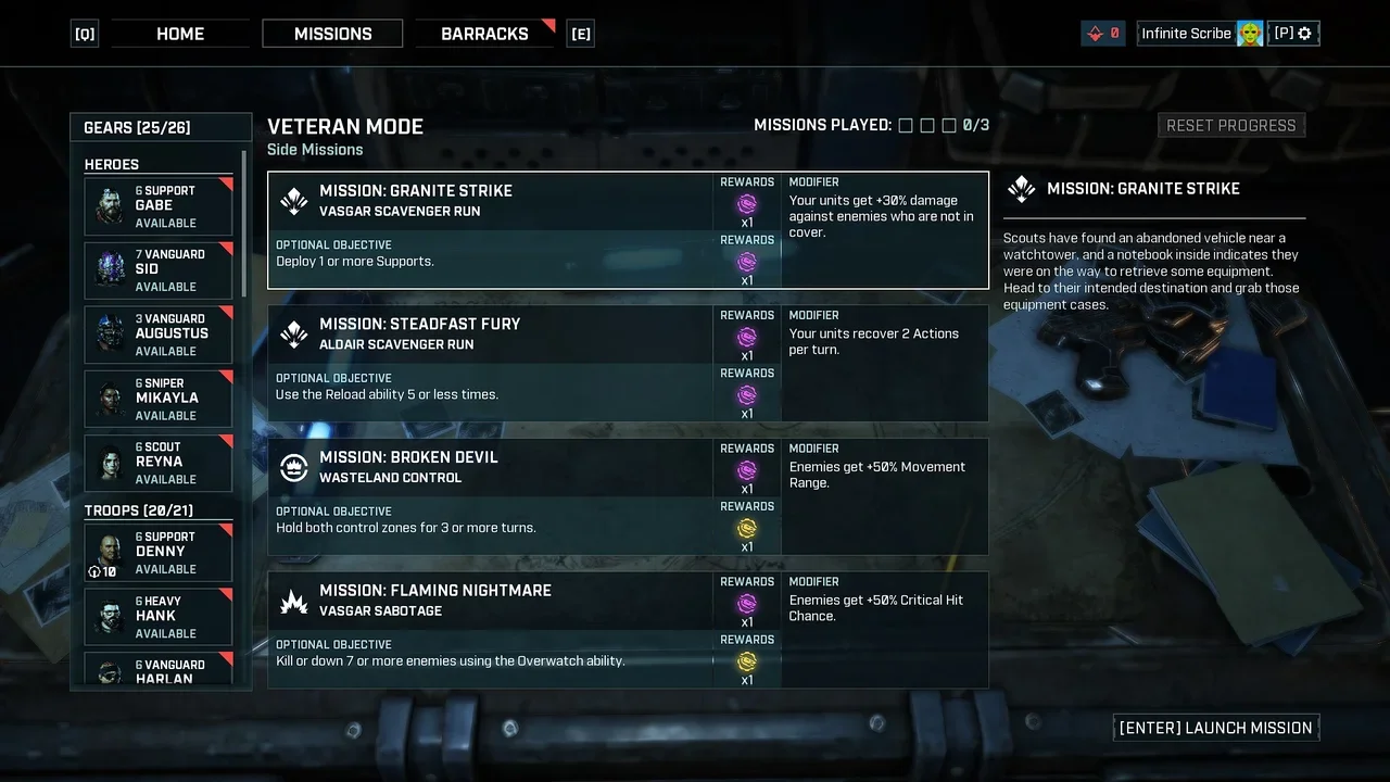
The mission screen was another area of focus, designed to clearly communicate objectives, rewards, difficulty, and squad readiness before deployment, with additional information required for veteran mode for after the player complete’s the core game missions that could allow for scalability with few or many missions available at one time.
The challenge here was to balance narrative context with functional clarity, surfacing the most critical information needed. A feature I introduced to better inform the player of their available resources, was to create a ‘reduced’ roster feature which displays a list of heroes available to be taken on missions. Different mission types were identified by the icon next to the mission name and players would need to make tactical decisions about which types of heroes they took to each mission. Each mission may also have specific requirements such as characters or classes to take to each mission, so the reduced roster allowed players to make informed decisions on which missions they played based on which heroes they had available and their most critical stats surfaced.
